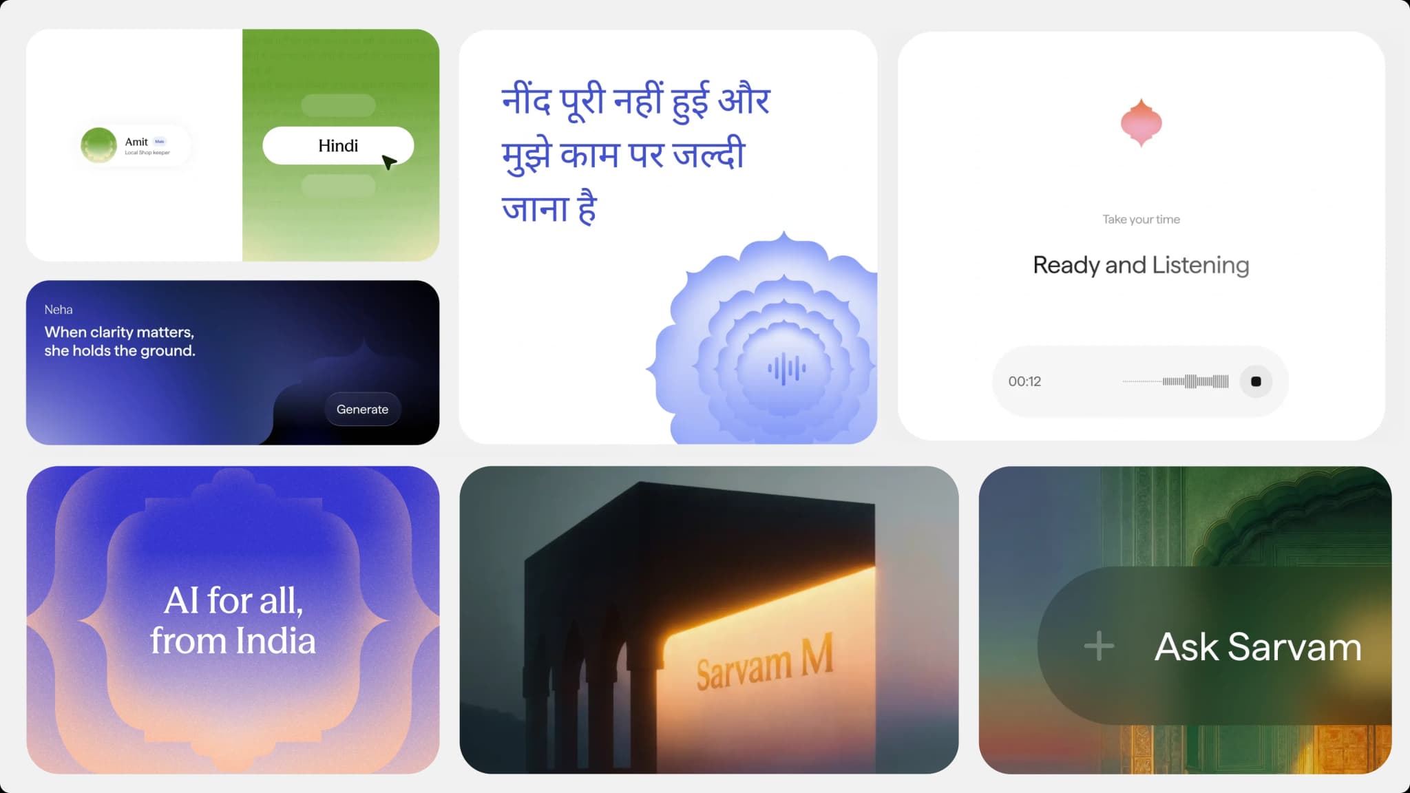
Indian AI startup Sarvam AI has introduced a new brand identity that reflects its growing ambition to build world-class artificial intelligence from India.
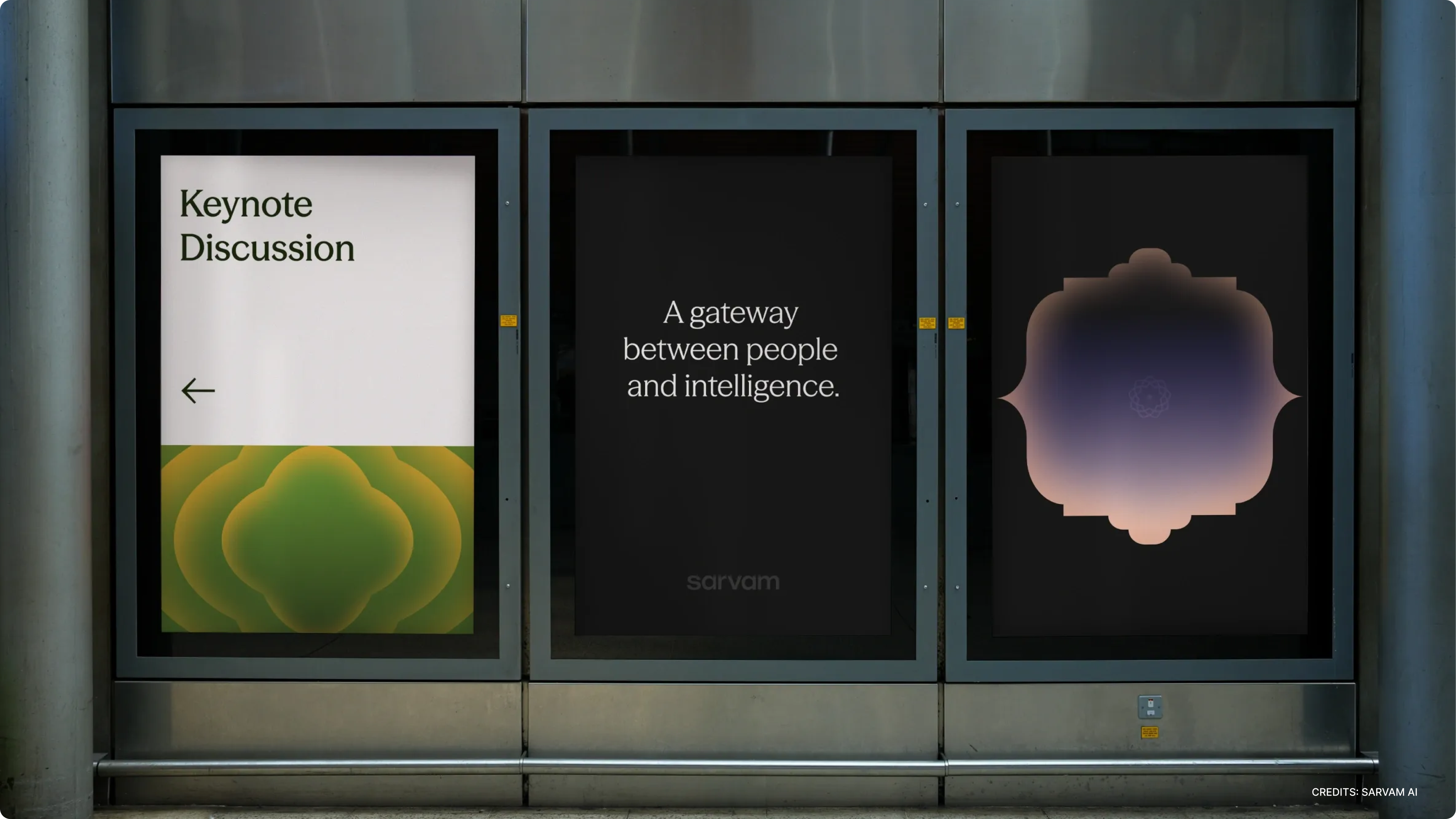
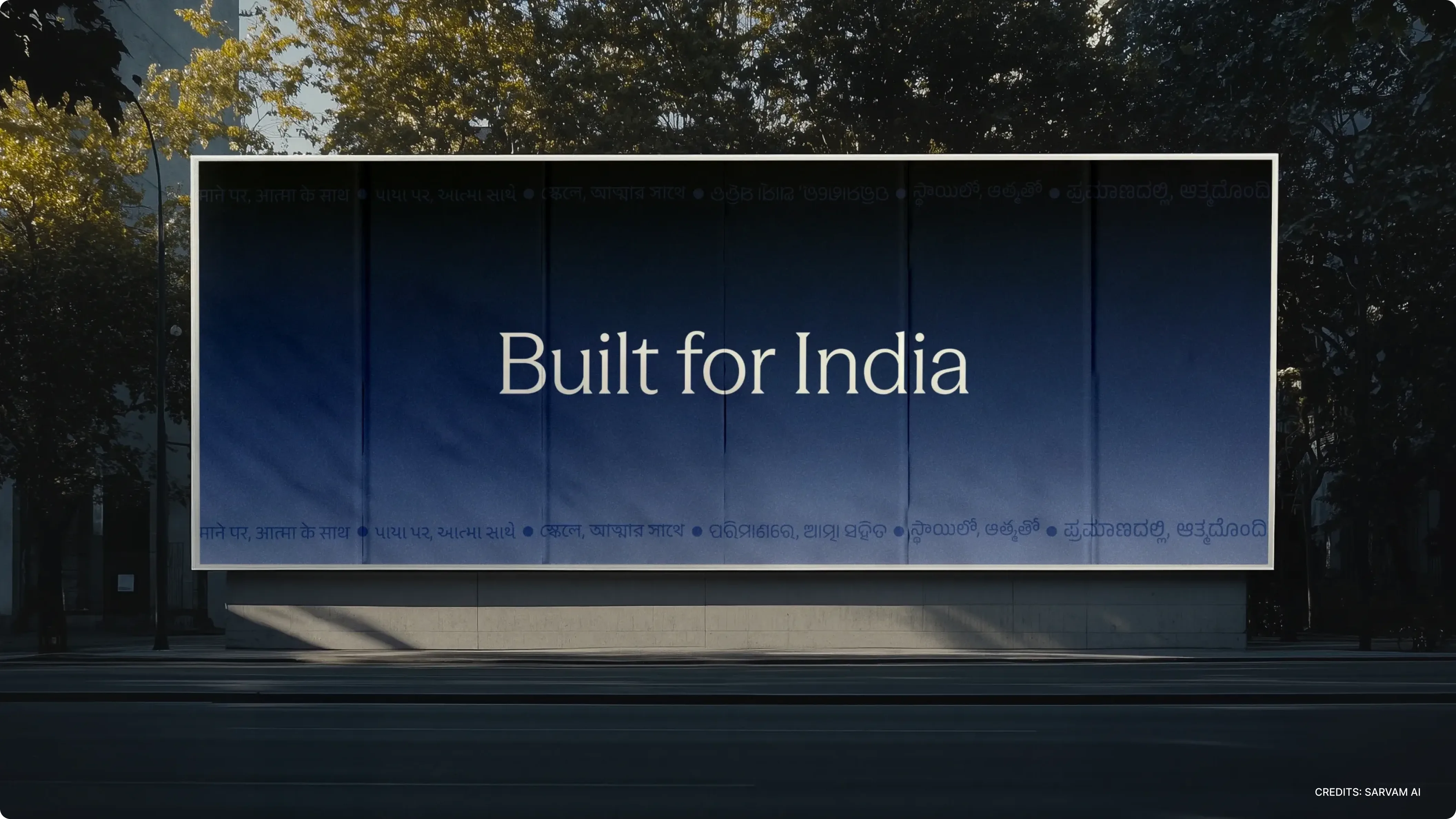
Sarvam’s mission is to develop AI systems that understand how India thinks, speaks, reasons and solves problems. As the company’s products and research have evolved, the brand needed to evolve as well. The new identity is designed to reflect the company’s larger vision of building AI for everyone, from India.
The name Sarvam comes from Sanskrit and translates to “everything” or “everyone.” The word represents the idea of wholeness, a system that includes many perspectives, languages and ways of thinking.
That philosophy sits at the center of Sarvam’s brand.
As the company grew, the team realized that the identity needed to do more than simply look modern. It had to represent the same thinking that guides the company’s AI models and technology. The brand needed to feel rooted in India while still being contemporary and globally relevant.
Rather than leaning on nostalgia or traditional symbolism, the goal was to build something that felt familiar, inclusive and modern at the same time.

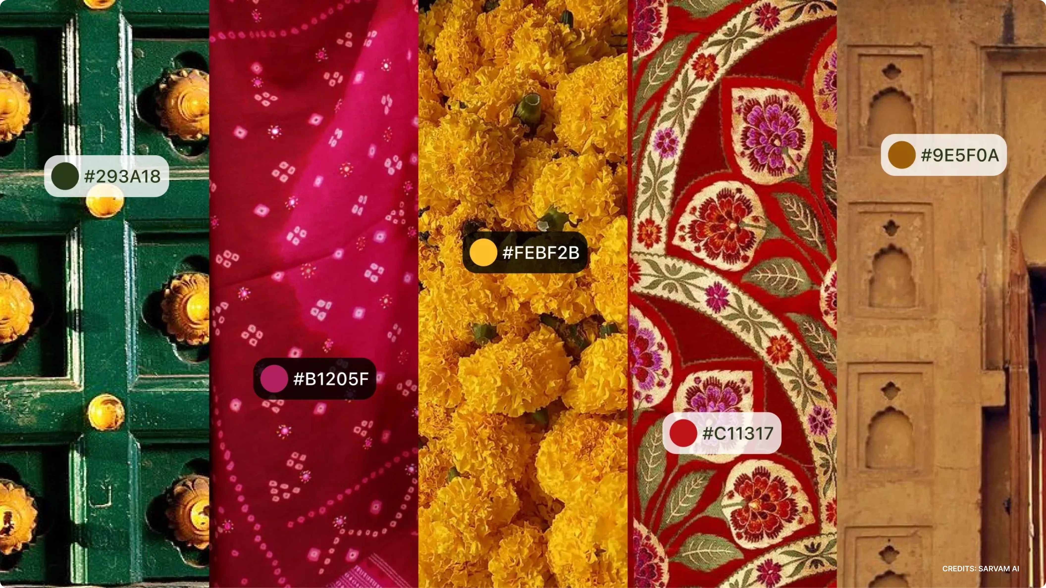
To develop the new identity, the team explored visual structures across India including language systems, architecture, craft traditions, textiles and everyday graphic patterns. Many directions were tested, from cultural motifs to symbolic references, but several felt too region-specific or overly decorative to scale as a modern design system.
The goal was to find a visual idea that felt shared across cultures, flexible enough to support multiple products and capable of growing with the company. This search eventually led to the concept of the gateway, a structure commonly found across Indian public spaces that symbolizes openness, entry and transition.