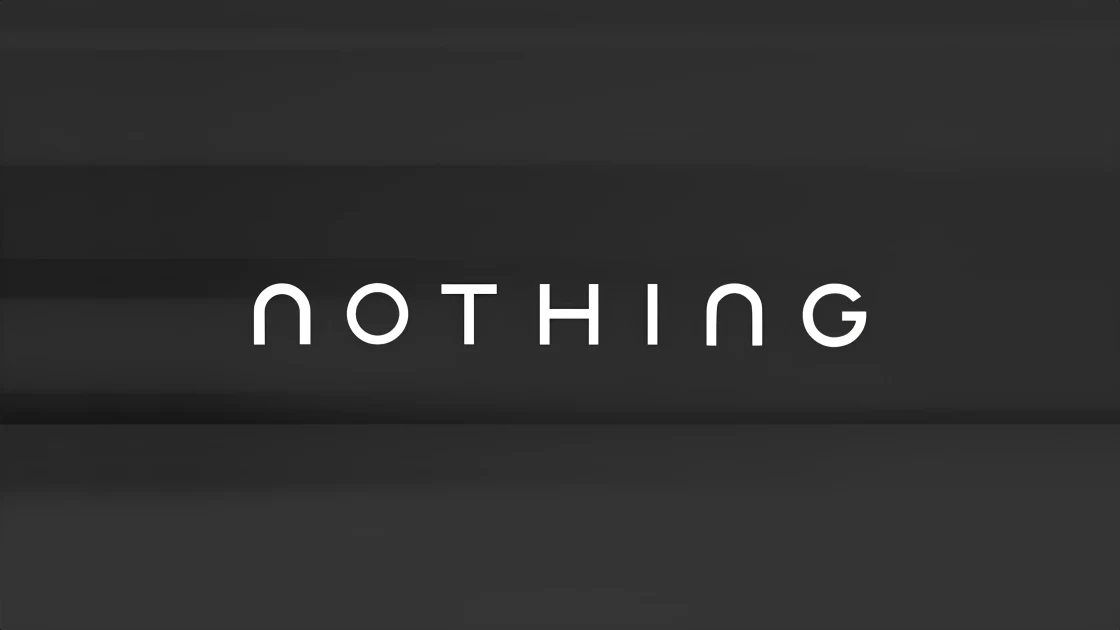
Nothing has teased a major brand identity change, starting with a new logo. The update was shared on X with the line, “Getting ready to make history.”
Just two monochrome visuals with a very different direction and that’s what caught everyone’s attention.
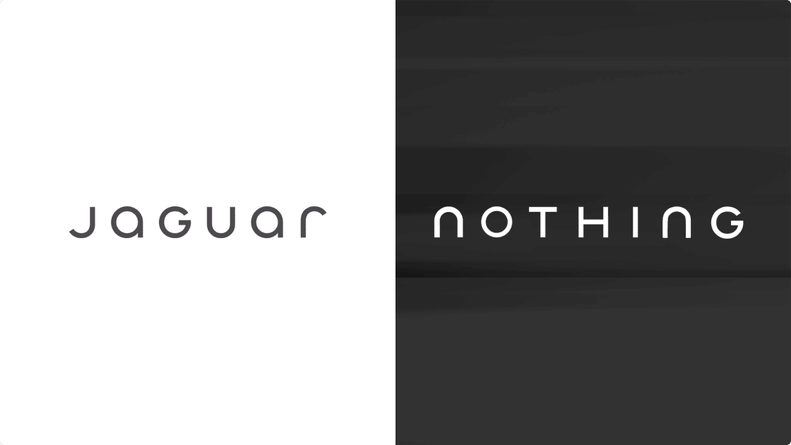
Since launch, Nothing has been known for its pixel-style, dot-matrix identity. It was distinctive, tech-forward and instantly recognisable. But the refreshed wordmark looks cleaner, more traditional and minimal. The playful pixel language seems to be replaced with a more conventional typographic approach.
The internet also noticed similarities between Nothing’s new look and Jaguar’s recent branding update. That led to debate especially because Nothing had earlier mocked Jaguar’s rebrand.
When Jaguar launched its new identity and slogans like “Copy Nothing,” Nothing responded with humour, temporarily changing its own logo and bio to parody Jaguar. That moment made the contrast between the two brands very clear.
Which is why this comparison feels awkward now. A brand that once leaned hard into being different is suddenly being compared to the very mainstream aesthetic it once joked about.