As YouTube completes 20 years, the platform is changing how its brand shows up across screens, products and experiences. This update is about building a system that can scale with how people actually consume content today.
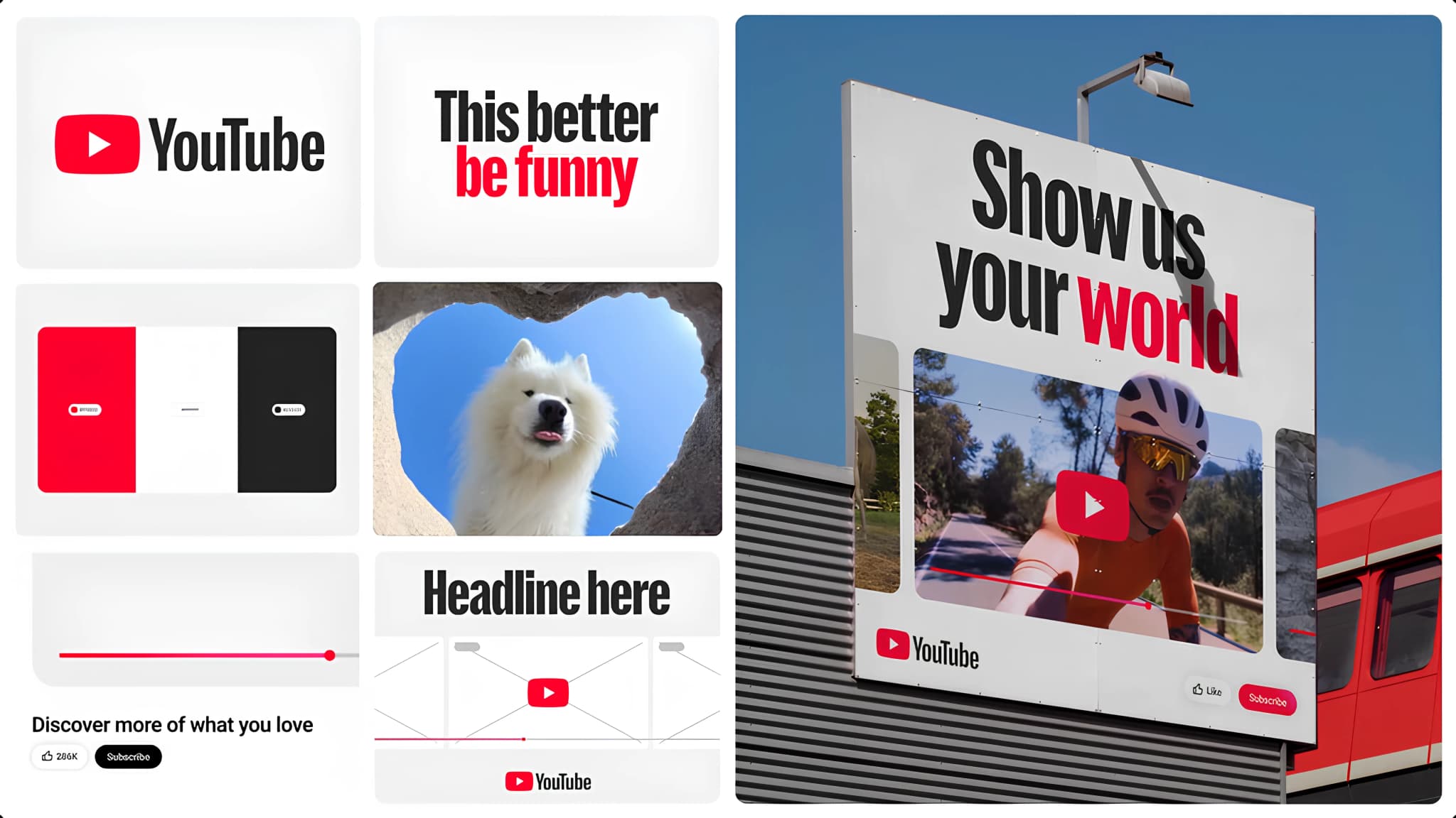
The biggest shift in YouTube’s new visual system is its move toward motion as a core brand element. For a platform built entirely around movement, video and creators, relying on mostly static branding no longer made sense.
This is YouTube’s first formal motion identity, designed to reflect the natural movements found in creator content rather than polished, corporate animations. The idea is that the brand should move the way the platform moves.
Alongside motion, YouTube introduced a custom typeface, YouTube Display, inspired by the geometry of its logo. This allows the brand to stay recognizable even without always showing the logo, which is critical for a platform that lives across multiple formats and interfaces.
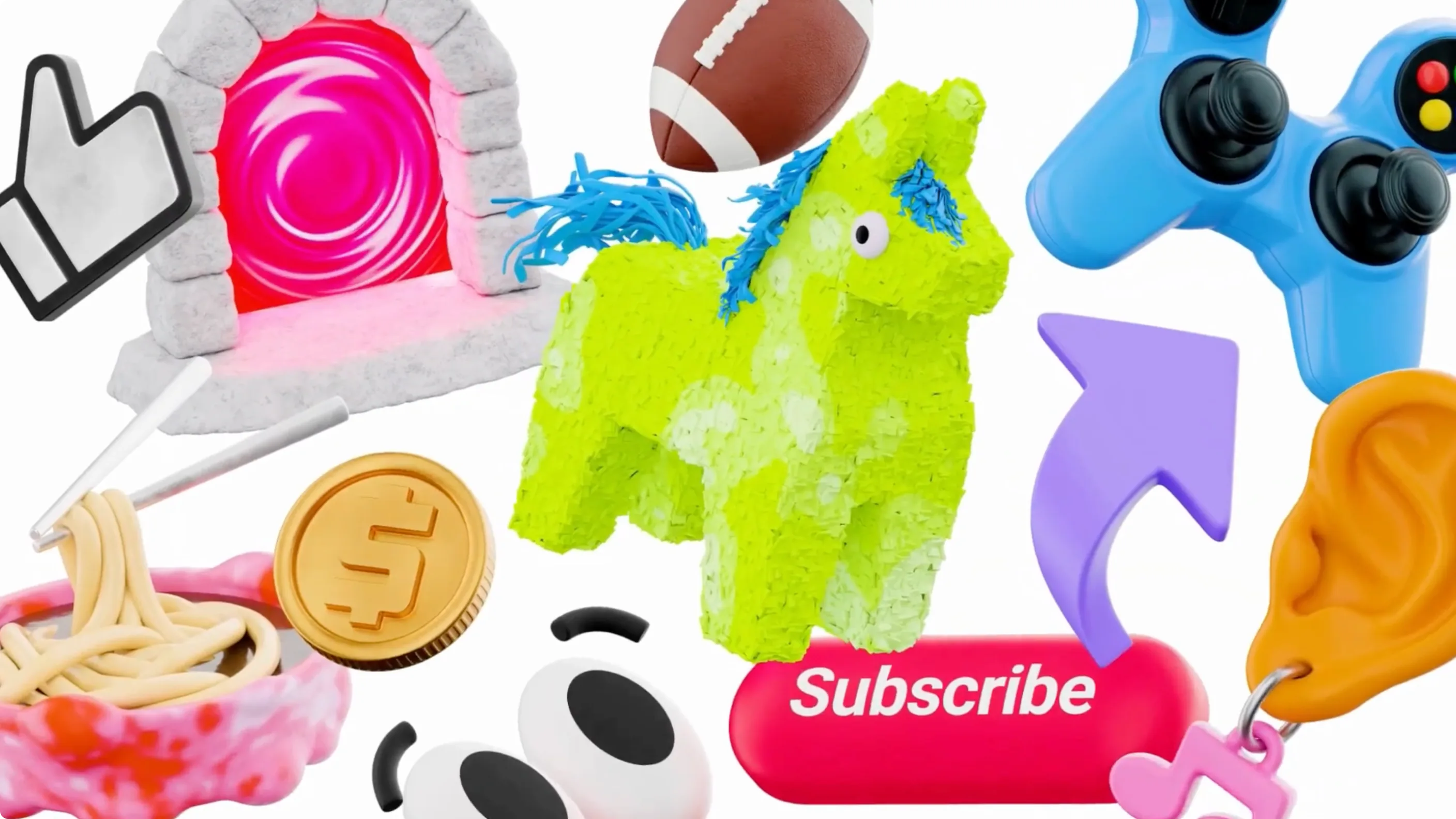
The new 3D illustration system adds another layer, bringing in a playful and curious tone that mirrors the diversity of content on the platform, without competing with creators themselves.