Domino’s is a name everyone knows and for the first time in 13 years, the pizza giant has decided it was time for a fresh look. But this is about making every part of the brand as irresistible as its pizza.
A new look that still feels like Domino’s
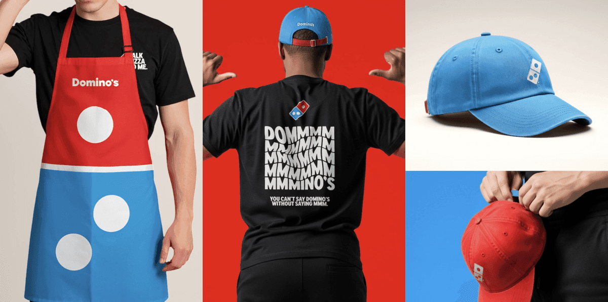
The update keeps the brand familiar but adds a modern, playful touch. The new colors are brighter and more vibrant, the typeface is bold and clean (Domino’s Sans) and the packaging now highlights the iconic red-and-blue logo more than ever.
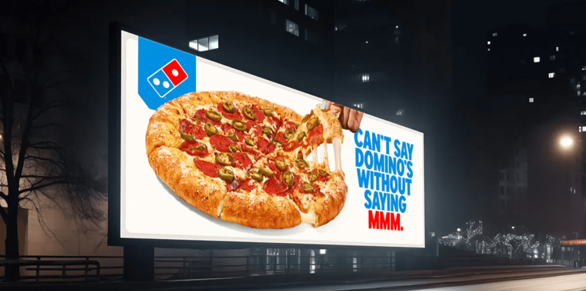
Domino’s also introduced a new jingle, “Dommmino’s,” featuring the voice of five-time GRAMMY® nominee Shaboozey. It’s designed to be catchy and fun, what the company calls a “cravemark.”
Making “craveability” part of the brand
The goal is to make people feel Domino’s.
Kate Trumbull, Domino’s Executive VP and Global Chief Marketing Officer, explained: “Rather than a traditional tagline, we’re baking craveability right into our name. You literally can’t say ‘Domino’s’ without saying ‘mmm.’”
The idea is that the brand should make people hungry, excited and happy every time.
Every part of Domino’s gets a refresh
This new look and feel is everywhere - the website, app, in-store signs, team uniforms, and marketing campaigns.
The rollout has started in the U.S. and will reach other countries in the coming months.
Why does this matter?
With more than 21,500 stores in 90+ countries and $19.4 billion in sales last year, Domino’s is huge. But even the biggest brands need to stay relevant.
By updating its look while keeping the core identity intact, Domino’s reminds people why they love it, while also catching the attention of a new generation of pizza fans.