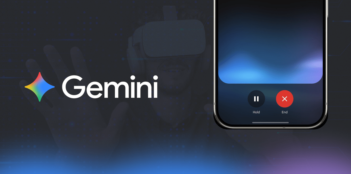
Google has recently given its AI service Gemini a makeover. The new design both in terms of logo and user experience shows a shift in how Google wants people to see Gemini. The most noticeable change is the logo. Until now, Gemini had its own purple and blue color scheme, but the redesign brings it into the fold of Google’s visual identity. The new logo uses the familiar gradient of blue, red, yellow, and green, the same colors we associate with Google Search, Chrome and the Play Store. This instantly gives Gemini a sense of belonging in the Google universe.
The logo’s structure has also been refined. While the star-like shape remains, its sharp edges have been softened into rounded, friendly curves. The change may look subtle at first, but it makes the logo easier to recognize and more approachable especially on smaller screens like mobile widgets. For a product that aims to become a daily-use tool, this kind of design choice matters more than we realize.
A Smoother User Experience
Along with the visual refresh, Gemini’s interface has also been polished. The model selection page is now cleaner and easier to navigate. Instead of technical jargon, users are shown clearer descriptions that help them choose the right option for their needs.
Why These Changes Matter
At first glance, a new logo may seem like a small update. But in reality, these changes are part of a much bigger picture. By aligning Gemini’s identity with its most recognizable products, Google is signaling that it wants Gemini to be seen as a household name.
For users, this means Gemini will likely become more integrated into everyday Google experiences, just like Search or Maps. For businesses, designers and brand builders, it’s another example of how visual identity and product experience can change how people perceive a service.