Every now and then, a legacy brand decides to peel back its layers and start fresh. Lay’s just did that.
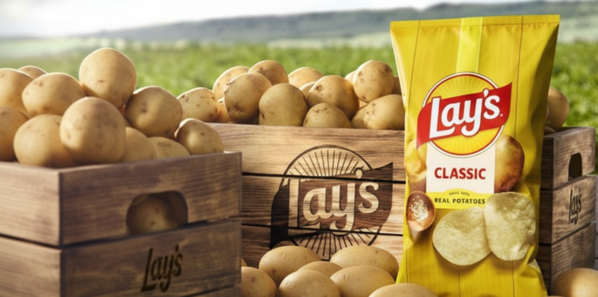
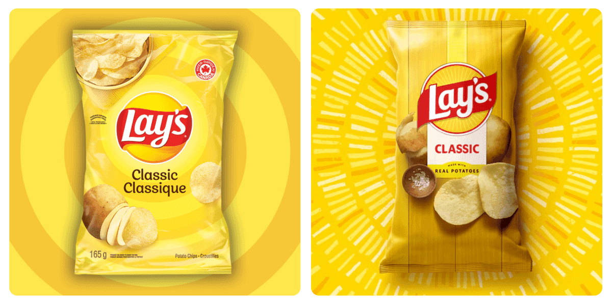
After almost 100 years, the brand unveiled a new look and recipe evolution that pays homage to its roots while setting the stage for the next century of snacking. The redesign is about reconnecting with where Lay’s truly began, on the farm.

Why It Matters:
Every chip begins as a potato, grown under the sun and nurtured with care. Yet, surprisingly, almost half of Lay’s fans didn’t know their favorite chips came from real potatoes.
That insight sparked the redesign to put the farm back at the heart of the brand story. Lay’s wanted to celebrate its agricultural heritage and remind people that real joy starts with real ingredients. The new identity blends nostalgia with modernity, showing that even the world’s biggest snack brand can go back to its roots.
A Global Icon:
The new Lay’s visual identity, led by PepsiCo’s Design & Innovation team, is warm, authentic and human.
The yellow sun in the logo now shines brighter and more distinct, with radiant “Lay’s Rays” symbolizing the sunlight that grows every potato. A fresh color palette takes inspiration from ingredients like golden yellow, savory red, earthy brown and pickle green.
And the photography shows the color and texture of every chip. The familiar red Lay’s ribbon stays untouched, tying back to the brand’s legacy of trust and taste.
Consumers at the Heart:
Lay’s also used this opportunity to rethink what’s inside the bag. By 2025, all core Lay’s products in the U.S. will be made with no artificial flavors or colors. The brand is shifting towards more natural, transparent ingredients while keeping that same iconic crunch intact.
New variants like Lay’s Baked with Olive Oil and Lay’s Kettle Cooked with Avocado Oil signal a future that balances indulgence and wellness.


