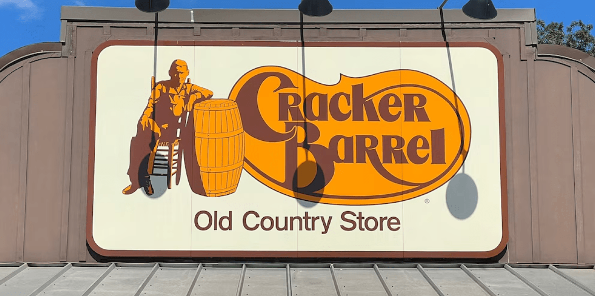
Cracker Barrel, the iconic US food and gift chain, recently updated its logo after 48 years.
The new design removes the familiar image of a man leaning on an oak barrel and replaces it with a simple all-text logo. While the change is meant to modernize the brand, it created immediate backlash on social media.
This isn’t unusual. Brands like Aunt Jemima, Uncle Ben’s, and Land O’Lakes have all faced criticism when updating long-standing logos or packaging.
Even Dunkin’ dropped “Donuts” from its name in 2018 and created debate. Changes that seem small to a company can feel personal to loyal customers who have built memories and trust around familiar visuals.
Why It Matters:
A logo is an emotional connection. Updating it can help a brand feel modern, but it also risks alienating loyal customers. Cracker Barrel’s redesign is simple, cleaner and more adaptable to digital platforms, but it replaces an image that has been part of people’s memories for decades.