This year, some of the biggest brands made small, smart design changes that say a lot about where they’re headed next. Here’s a quick look at what changed and what it tells us.
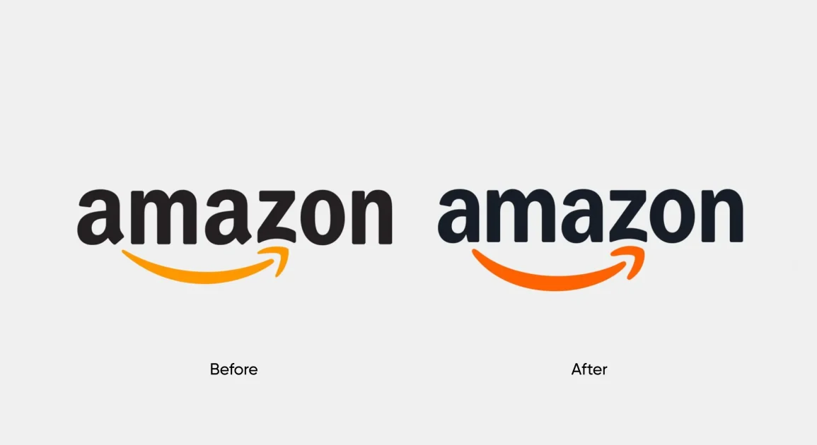
1. Amazon
Amazon refined its visual system. The smile, typography and layouts were cleaned up to feel more consistent across apps, packaging and services. The focus was on making a massive ecosystem feel simpler and more connected.
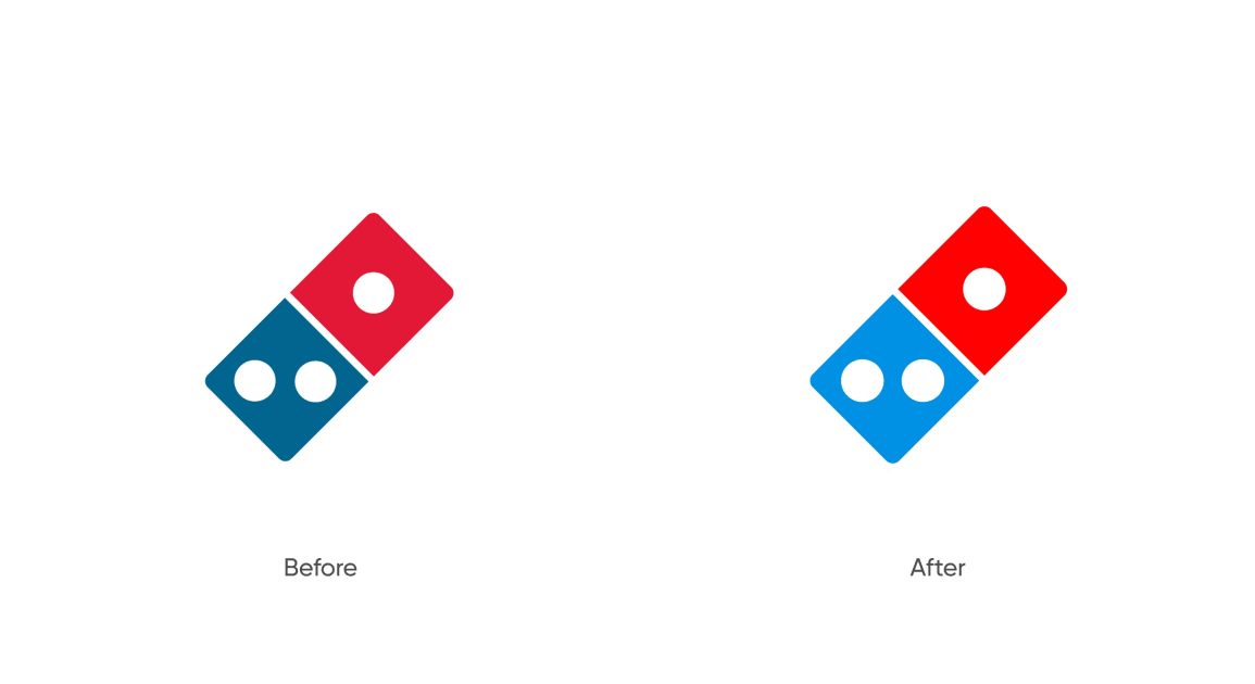
2. Domino's
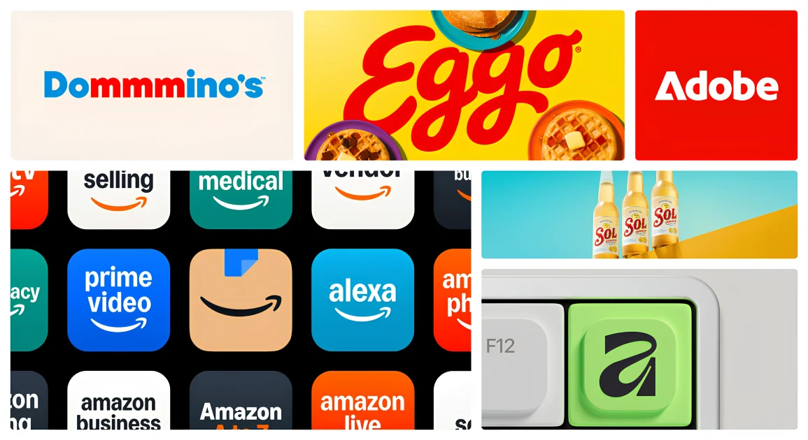
Domino’s moved further into clarity and digital-first design. The updates focused on cleaner layouts and stronger hierarchy, making ordering faster and easier. It’s less about branding flair and more about usability.
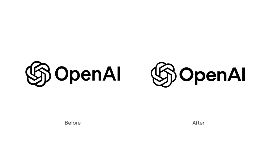
3. Open AI
OpenAI’s design updates brought more warmth and structure to a complex product. The visuals feel calmer and more human, helping people feel less intimidated by powerful technology and more invited to explore it.
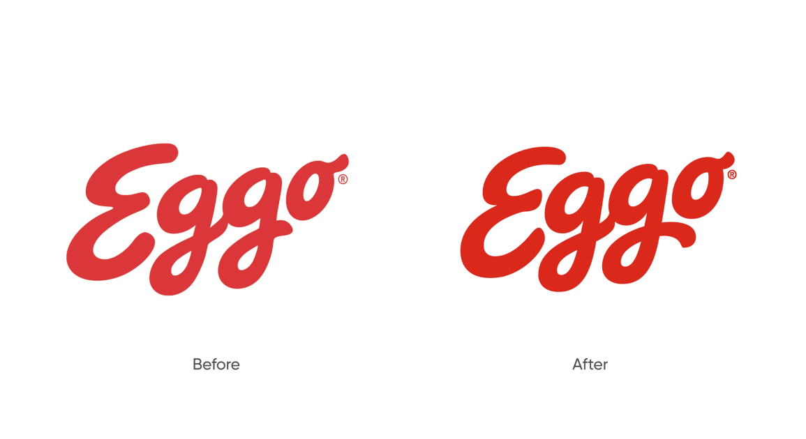
4. Eggo
Eggo refreshed its packaging to feel more playful and contemporary. Brighter colours, bolder typography and simpler layouts helped the brand speak directly to a younger audience without losing its nostalgic charm.
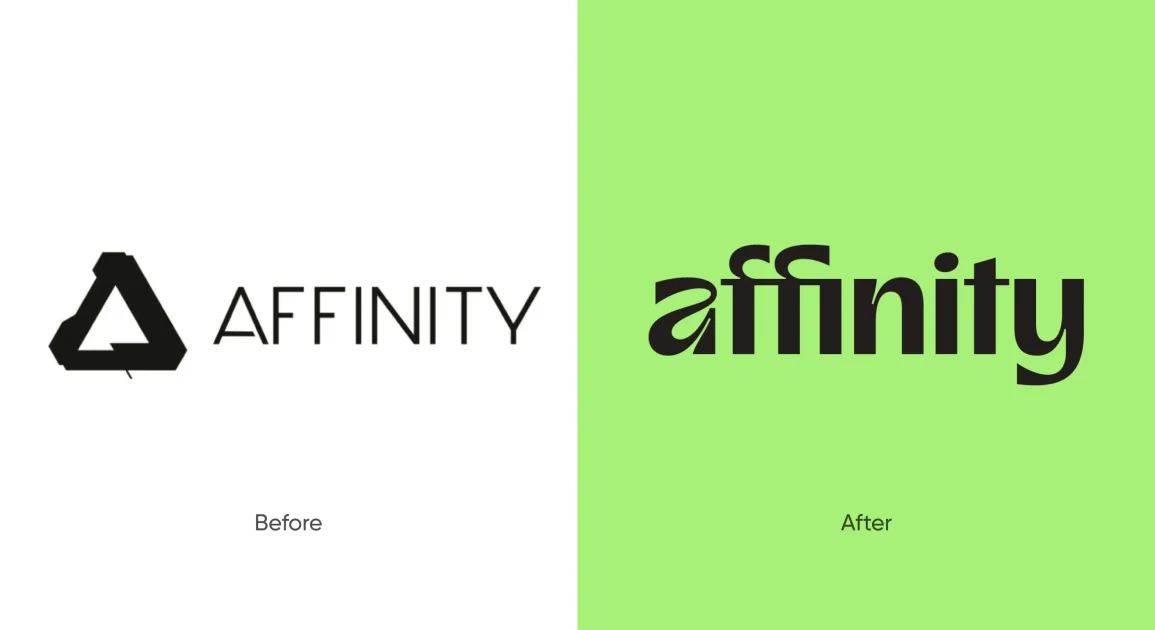
5. Affinity
The system feels more modern and modular, designed to scale across products while staying functional for everyday design work.
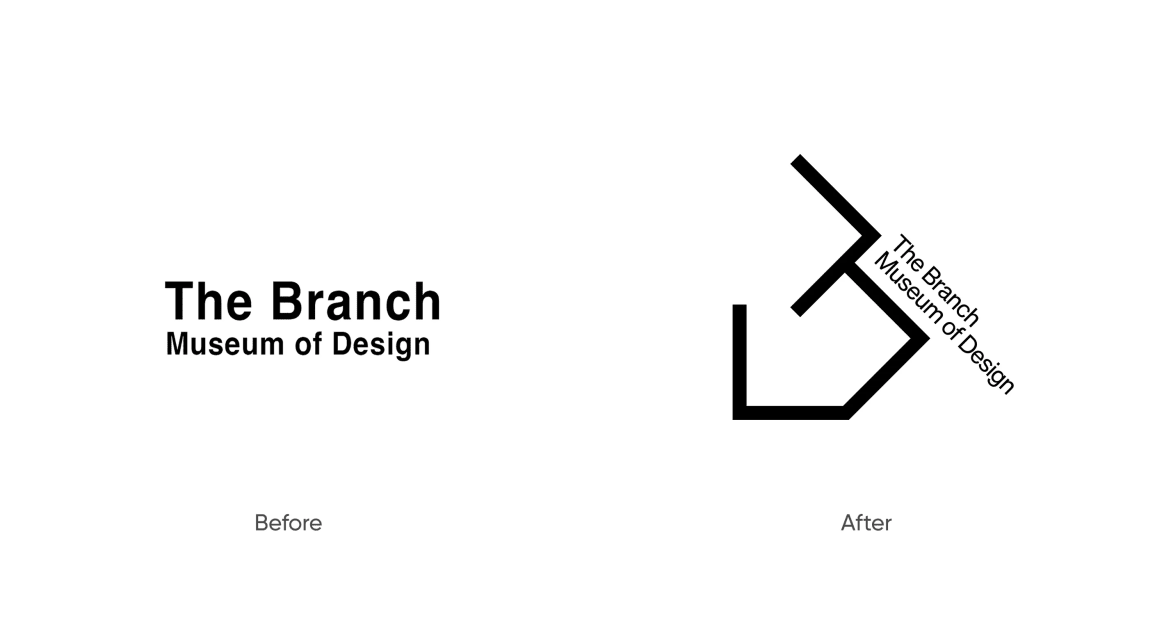
6. The Branch Museum of Design
The museum’s identity update brought a stronger focus on storytelling. The visuals feel thoughtful and cultural, helping the institution position design as something lived and experienced.
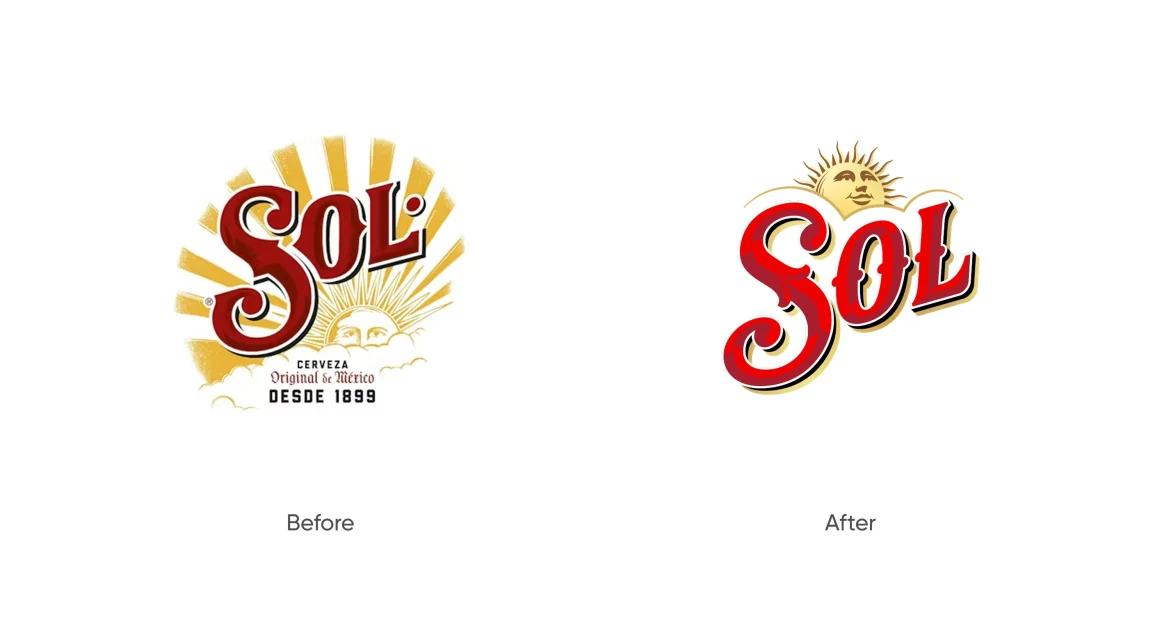
7. Sol
Sol’s refresh leaned into minimalism and tone. Cleaner visuals and restrained colour choices helped the brand feel more premium and intentional, without losing its laid-back character.
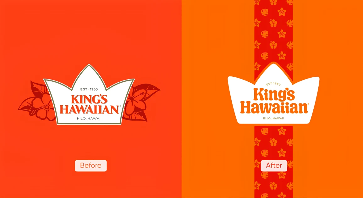
8. King's Hawaiian
King’s Hawaiian updated its packaging to improve shelf clarity while keeping its familiar warmth. The design feels more structured, making the brand easier to spot without losing what people already love.
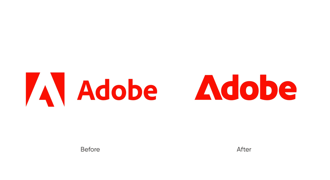
9. Adobe
Adobe refined its system to bring consistency across its growing product suite. The updates focused on simplifying navigation and unifying the experience, helping users move between tools more smoothly.