PRINK started with a simple problem. People want healthier drinks, but most of them still reach for soda.
The idea was to build something that feels familiar, tastes good and does better for you. A prebiotic soda with zero sugar, clean ingredients and flavours that don’t feel niche or intimidating.
The audience was Gen Z and millennials, health-conscious urban consumers, people who read labels and care about what goes into their body. This clarity helped shape everything that followed.
Before any visuals, we studied the market. From global soda brands to Indian startups, kombuchas and zero-sugar drinks, we looked at what already existed and where PRINK could stand apart.
We explored three logo directions:
Playful and bold
Soft and organic, and
Clean and functional.
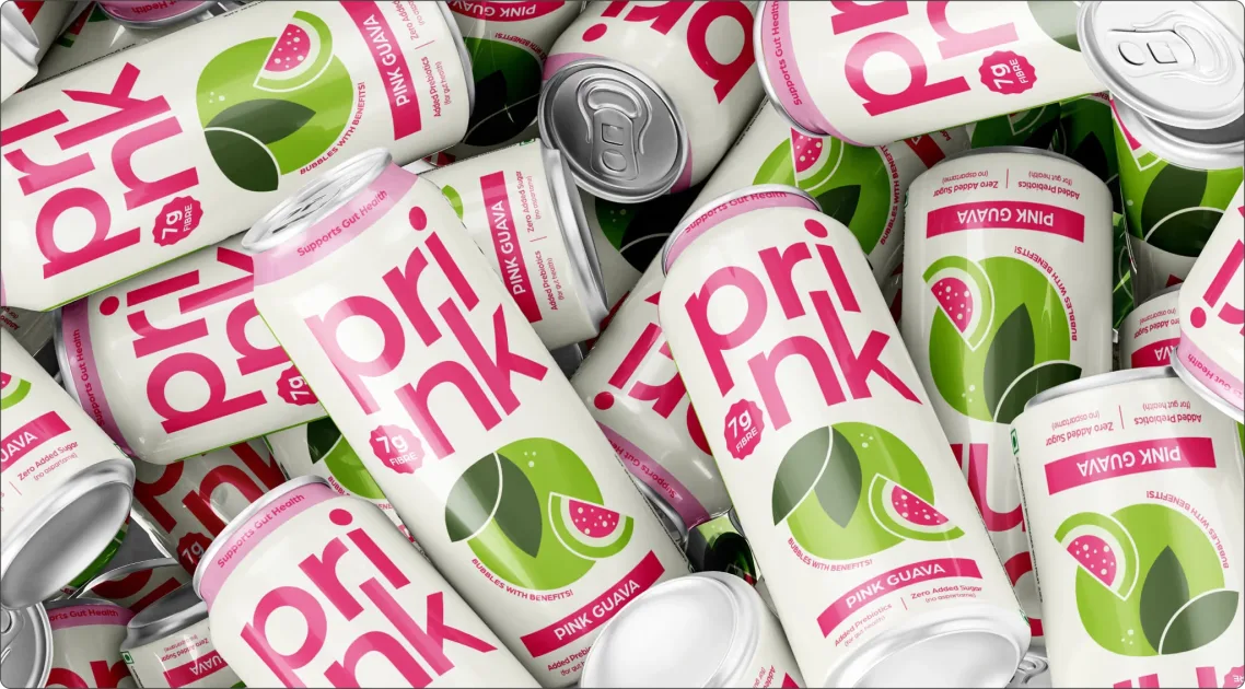
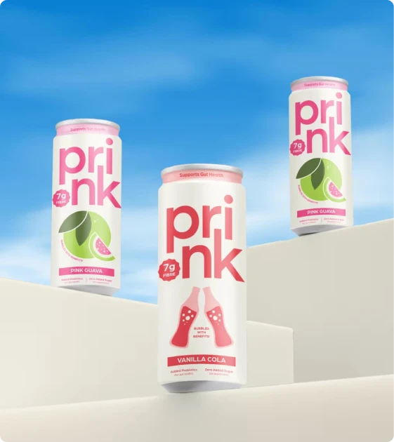
Instead of showing logos in isolation, we placed them directly on cans, because that’s where they would live.
One concept looked great on paper but failed on the can. The logo took up too much space, leaving no room for flavour illustrations or information. That’s when we refined instead of restarting. By reworking the layout and stacking elements differently, everything finally clicked. The logo breathed, the can opened up and the system made sense.
That was the moment we knew we had it.

The final design keeps things simple. Clear branding, easy flavour recognition and enough information to build trust without overwhelming the buyer. Nothing is shouting for attention, but nothing feels invisible either.